Have you ever looked at an item and wondered who on earth gave the OK to sign off that design? While sometimes companies do this to create controversy others simply do not think. To show you exactly what we mean, here are a selection of packaging fails that should have been spotted before they went into production:
Packaging Fails Your Need To Know About
Balls Up
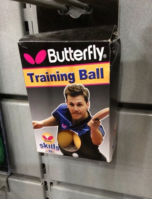
The idea here makes sense, people want to be able to see the balls they are purchasing. However, cutting out a hollow right in the middle of the player’s bosom probably wasn’t the best idea now was it? This is a classic case of a good idea not going well, so always remember to check your product before putting in into production.
Oh no it isn’t!
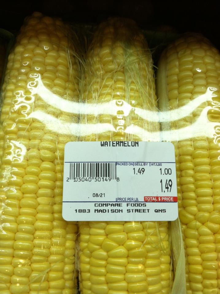
Food packaging suppliers aren’t immune from a packaging mistake either, and this one may be simple but it is definitely a huge blunder! How anyone could mistake sweetcorn for a watermelon is unfathomable. While technically the packaging is fine, plenty of people have had a laugh over this mislabelling error.
Umm, no thanks…
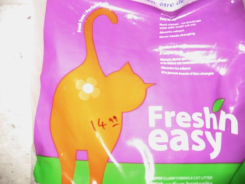
Why on earth would this be considered a good idea? It isn’t appealing, it doesn’t sell the product and it isn’t even done in an obviously funny way. If you are going to try and be a bit controversial then at least have the decency to do it right!
Poor Font Choice
Via @serenaeryan
Sometimes you can just be too close to a project to see that something a little bit wrong. This is a poor font choice that can easily slip past anyone without a dirty mind or a keen eye. Always remember to get a second opinion on your food packaging design before putting it into shops!
Wrong again!
Via @signit_diy
Seriously, how do you get this so wrong? Carrots and potatoes look nothing alike… this sounds like a case of improvised food packing supplies to make up for differences in stock and availability. Here’s a tip, make sure your food packaging suppliers can give you the packaging you need in the quantity you need it to avoid issues like this!
So, what’s it for?
Via @redditfunnybot
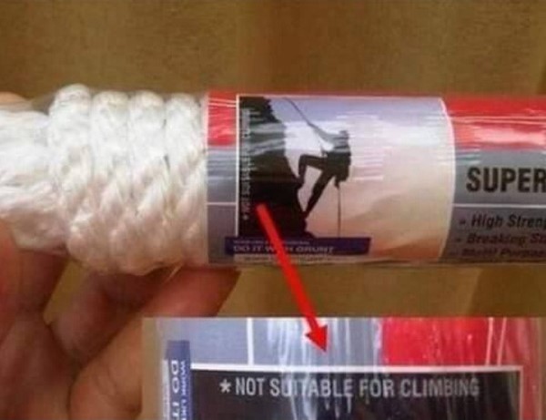
This is actually a really confusing and misleading one that could end the manufacturer in a bit of trouble. Why have a picture demonstrating a use that is not suitable for the product? This is incredibly misleading and should never have got passed the ideas stage, let alone being printed and packaged like this.
Care a Little
Via @wildaloe
Knowing your audience is essential and it really doesn’t take much to think that if you’re selling shampoo then you should probably have someone with hair on your packaging… come on now. This is either a clever Photoshop or someone at Head & Shoulders isn’t very good at their job.
Overkill
Via @wiseclown91
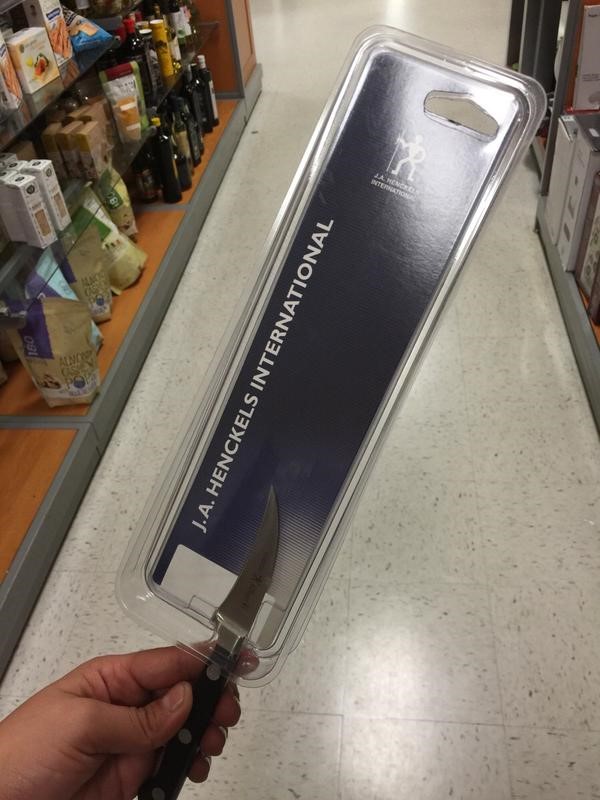
Not only does this look ridiculous, but if you’re doing this for every knife then you’ll be wasting a huge amount of money on your packaging. Make sure that you tailor your packaging perfectly for your product otherwise you’ll end up paying out more than you want to and end up with funny looking items like this.
Get in touch today to speak to professional food packaging suppliers who know how to best help your business.

